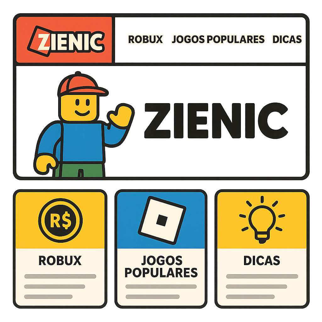
Zienic works best when its menu feels obvious on the first visit. Roblox fans often arrive looking for one thing quickly, whether that is a game list, a tips page, or a fresh update about rewards and play styles. A clean structure lowers friction, helps people trust the site, and
gives every page a clear purpose. The goal is not to add more links, but to make the right links easy to spot. This article outlines a simple navigation model that balances discovery with speed. It starts with a visible header, continues through a focused main menu, and ends with
Header with logo and search
helpful footer links that support return visits. Each section has a job, and each link should answer a common need. When the layout reflects how fans actually browse, the site feels easier, calmer, and more useful. The header should set the tone immediately by showing the
logo, a short label, and a search box that is easy to reach on desktop and mobile. Search is especially useful for players who already know the page topic and do not want to scan the full menu. Keep the header compact, but do not hide
important entry points inside crowded controls. The best header helps visitors orient themselves before they start exploring. Place the logo on the left, the search field near the center or top right, and only a few top-level items beside it. This keeps the first screen
simple while still giving power users a fast way to jump around. If the search icon is used on small screens, make sure it expands into a full input with clear placeholder text. A header like this reduces confusion and supports both new and returning visitors.
Main menu with Robux, Popular Games, and Tips
The main menu should reflect the most common reasons people visit a Roblox fan site. A practical set of links might include Robux guidance, Popular Games, and Tips, with each item leading to a focused hub page. These labels are concrete, short, and familiar, which
makes them easier to scan than creative but vague names. Good navigation tells users where to go before they need to think too hard. Robux content can cover earning, spending, and safety in one organized area. Popular Games can group trending titles, updates, and play
guides, while Tips can collect beginner help and advanced shortcuts. If the menu stays limited to a small number of major choices, visitors are less likely to feel lost. The result is a structure that matches intent and keeps the site from becoming cluttered.
Why limited menu depth matters
Deep menus often create extra work for visitors because they force people to remember where each page lives. A shorter menu hierarchy helps users move from the homepage to a topic page and then to supporting articles without constant backtracking. It also makes mobile navigation
easier, since compact menus are less frustrating on smaller screens. Limited depth is not a restriction; it is a way to protect attention and speed. When a player clicks a category, the next level should show only the most useful subtopics. That might include
beginner guides, news, or curated lists, but each choice should be meaningful and clearly named. Avoid stacking too many nested layers under one label, because the structure becomes harder to learn over time. Simple depth improves wayfinding and keeps the experience consistent across devices.
Homepage highlights
The homepage should act like a guided starting point rather than a noisy billboard. Highlight the newest article, a featured game roundup, and one strong call to action such as Browse Tips or Explore Games. These blocks help first-time visitors understand what the
site offers without reading everything on the page. A useful homepage reduces decision fatigue and creates a smoother path into the rest of the site. Use visual cards, short summaries, and clear button labels so people can act quickly. Keep the most important content
above the fold, but leave room for secondary sections that support discovery. If the homepage includes a welcome note, make it brief and practical instead of promotional. The best highlights provide direction, not distraction, and they should connect naturally to the main menu.
Category pages
Category pages should do more than list posts; they should explain what kind of information belongs there. Each page can begin with a short introduction, followed by grouped articles, filters, or featured resources that make browsing easier. For example, a Popular Games page might sort
content by trend, platform, or update frequency. Clear category design helps visitors predict what they will find and where to click next. These pages are also a good place to reinforce internal links. A Robux guide can point to safety advice, a beginner tip can
lead to advanced strategy, and a game review can send readers back to a related roundup. This web of links keeps people moving through the site without repeating the same search. Strong category pages make the menu feel useful long after the first click.
How labels guide expectations
Labels work best when they match the reader’s mental model. If a visitor sees Tips, they expect help and advice; if they see Popular Games, they expect a ranked or curated set of game-related pages. Avoid labels that sound clever
but hide meaning, because unclear names slow down browsing. A well-labeled site feels honest, predictable, and easier to learn. Consistency matters across page titles, menu items, and section headers. When the same terms appear in several places, visitors can confirm they
are in the right area and move with confidence. This is especially helpful for fans who return often and want to resume browsing without relearning the layout. Clear labels turn the menu into a reliable map rather than a guessing game.
Footer with safety and useful links
The footer should close the journey with practical links that people may need after browsing the main content. Add safety notes, contact details, policy pages, and a few helpful shortcuts such as about, terms, and support. This area is also a good place for a smaller secondary menu that does not need top-level attention. A
thoughtful footer adds trust and gives visitors a final path when the main navigation is not enough. For a Roblox audience, safety links matter because players and parents often look for guidance on accounts, spending, and community behavior. The footer can also repeat important pages in a simple text format for users who prefer less visual
clutter. Keep the links organized and avoid overloading this area with the same items already used in the header. A clean footer completes the architecture and supports the site’s overall usability. With this structure, Zienic can feel direct, readable, and built around how people actually browse. The header offers quick orientation, the main menu
presents the most important topics, the homepage guides discovery, category pages deepen the journey, and the footer supports trust. Together, these parts create a simple navigation system that helps Roblox fans find value fast. That is the core of good user experience: fewer obstacles, clearer choices, and a path that makes sense from the start.